這是要實現的效果:
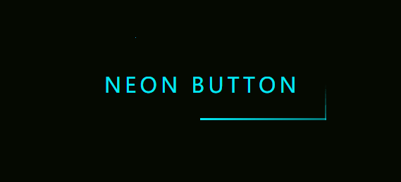
可以看到,在鼠標移入按鈕的時候,會產生類似霓虹燈光的效果;在鼠標移出按鈕的時候,會有一束光沿著固定的軌跡(按鈕外圍)運動。
霓虹燈光的實現
霓虹燈光的實現比較簡單,用多重陰影來做即可。我們給按鈕加三層陰影,從內到外每層陰影的模糊半徑遞增,這樣的多個陰影疊加在一起,就可以形成一個類似霓虹燈光的效果。這段的代碼如下:
HTML:
 <div class="light">
    Neon Button
 </div>
CSS:
body {
 background: #050901;
}
.light {
  width: fit-content;
  padding: 25px 30px;
  color: #03e9f4;
  font-size: 24px;
  text-transform: uppercase;
  transition: 0.5s;
  letter-spacing: 4px;
  cursor: pointer;
}
.light:hover {
  background-color: #03e9f4;
  color: #050801;
  box-shadow: 0 0 5px #03e9f4,
              0 0 25px #03e9f4,
              0 0 50px #03e9f4,
              0 0 200px #03e9f4;
}
最終的效果如下:

運動光束的實現
雖然看起來只有一個光束沿著按鈕的邊緣運動,但實際上這是四個光束沿著不同方向運動之后疊加的效果。它們運動的方向分別是:從左往右、從上往下、從右往左、從下往上,如下圖所示:
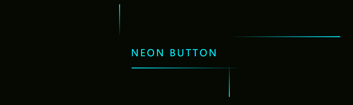
在這個過程中,光束和光束之間產生了交集,如果只看按鈕的邊緣部分,就很像是只有一個光束在做順時針方向的運動。
下面是具體實現中幾個需要注意的點:
- 四個光束分別對應 div.light 的四個子 div,初始位置分別是在按鈕的最左側、最上方、最右側和最下方,并按照固定的方向做重復的運動
- 每個光束的高度或寬度都很小(只有 2px),并且都有一個從透明色到霓虹色的漸變,因此外表會有一個收束的效果(即看上去不是一條完整的線條)
- 為了確保我們看到的是一個順時針方向的運動,四個光束的運動實際上是有序的,首先是按鈕上方的光束開始運動,在一段時間后,右側的光束運動,在一段時間后,下方的光束運動,在一段時間后,左側的光束運動。光束和光束之間的運動有一個延遲,以上方和右側的光束為例,如果它們同時開始運動,由于右側的運動距離小于上方的運動距離,就會導致這兩個光束錯過相交的時機,我們看到的就會是斷開的、不連貫的光束。既然右側光束的運動距離比較短,為了讓上方光束可以“追上”它,我們就得讓右側光束“延遲出發”,因此要給它一個動畫延遲;同理,剩余兩個光束也要有一個動畫延遲。多個動畫延遲之間大概相差 0.25 秒即可。
- 只需要顯示按鈕邊緣的光束就夠了,因此給 div.light 設置一個溢出隱藏
代碼如下:
HTML:
<div class="light">
    <div></div>
    <div></div>
    <div></div>
    <div></div>
    Neon Button
</div>
CSS:
.light {
  position: relative;
  padding: 25px 30px;
  color: #03e9f4;
  font-size: 24px;
  text-transform: uppercase;
  transition: 0.5s;
  letter-spacing: 4px;
  cursor: pointer;
  overflow: hidden;
}
.light:hover {
  background-color: #03e9f4;
  color: #050801;
  box-shadow: 0 0 5px #03e9f4,
              0 0 25px #03e9f4,
              0 0 50px #03e9f4,
              0 0 200px #03e9f4;
}
.light div {
  position: absolute;
}
.light div:nth-child(1){
  width: 100%;
  height: 2px;
  top: 0;
  left: -100%;
  background: linear-gradient(to right,transparent,#03e9f4);
  animation: animate1 1s linear infinite;
}
.light div:nth-child(2){
  width: 2px;
  height: 100%;
  top: -100%;
  right: 0;
  background: linear-gradient(to bottom,transparent,#03e9f4);
  animation: animate2 1s linear infinite;
  animation-delay: 0.25s;
}
.light div:nth-child(3){
  width: 100%;
  height: 2px;
  bottom: 0;
  right: -100%;
  background: linear-gradient(to left,transparent,#03e9f4);
  animation: animate3 1s linear infinite;
  animation-delay: 0.5s;
}
.light div:nth-child(4){
  width: 2px;
  height: 100%;
  bottom: -100%;
  left: 0;
  background: linear-gradient(to top,transparent,#03e9f4);
  animation: animate4 1s linear infinite;
  animation-delay: 0.75s;
}
@keyframes animate1 {
  0% {
    left: -100%;
  }
  50%,100% {
    left: 100%;
  }
}
@keyframes animate2 {
  0% {
    top: -100%;
  }
  50%,100% {
    top: 100%;
  }
}
@keyframes animate3 {
  0% {
    right: -100%;
  }
  50%,100% {
    right: 100%;
  }
}
@keyframes animate4 {
  0% {
    bottom: -100%;
  }
  50%,100% {
    bottom: 100%;
  }
}
這樣就可以達到文章開頭圖片的效果了。
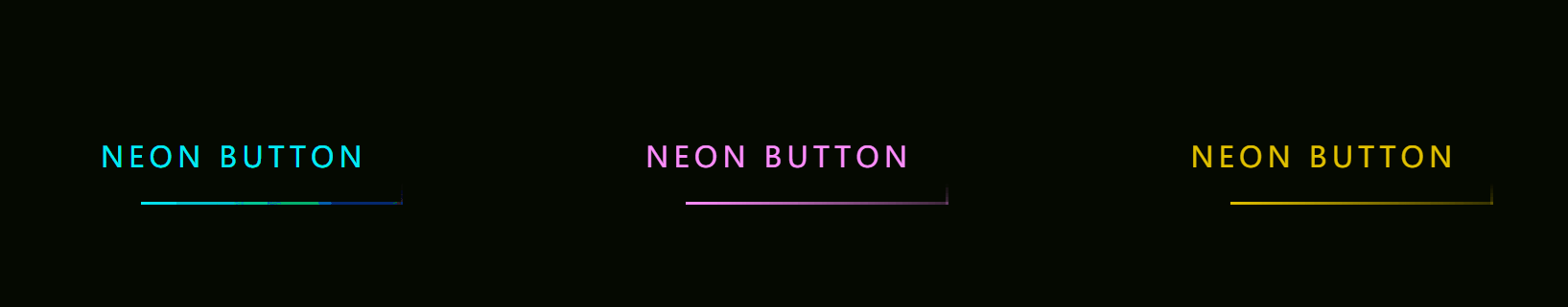
不同顏色的霓虹燈
如果想要其它顏色的霓虹燈光效果怎么辦呢?是否需要把相關的顏色重新修改一遍?其實我們有更簡單的方法,就是使用 filter:hue-rotate(20deg) 一次性修改 div.light 和內部所有元素的色相/色調。
The hue-rotate() CSS function rotates the hue of an element and its contents.
最終效果如下:
以上就是純 CSS3實現的霓虹燈特效的詳細內容,更多關于CSS3實現霓虹燈特效的資料請關注腳本之家其它相關文章!
