很多小伙伴在前端學習的時候�,發現盒子模型默認為正方形��。如何把盒子變成想要的模型呢��? 首先我們來看一下默認的情況----
<!DOCTYPE html>
<html lang="en">
<head>
    <meta charset="UTF-8">
    <meta http-equiv="X-UA-Compatible" content="IE=edge">
    <meta name="viewport" content="width=, initial-scale=1.0">
    <style>
        .box{
            width: 100px;
            height: 100px;
            background-color: rgb(116, 51, 51);
            box-shadow:0 10px 10px red;
            text-align: center;
            position:absolute;
            margin:0 auto;
            left:0;
            right:0;
            bottom:0;
            top:0;

        }
    </style>
    <title>Document</title>
</head>
<body>
    <div class="box">

    </div>
</body>
</html>
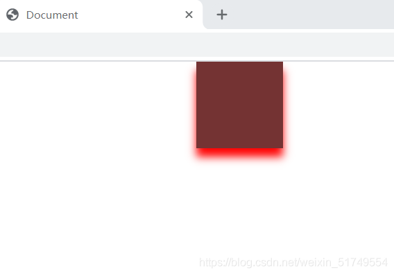
默認情況下為正方形,也許小伙伴覺得不太好看��。 我們換成圓形的試試����!
<!DOCTYPE html>
<html lang="en">
<head>
    <meta charset="UTF-8">
    <meta http-equiv="X-UA-Compatible" content="IE=edge">
    <meta name="viewport" content="width=device-width, initial-scale=1.0">
    <style>
        .box{
            width: 100px;
            height: 100px;
            border-radius: 50%;
            background-color: rgb(28, 99, 60);
            border: 5px solid rgb(55, 0, 255);
            position: absolute;
            margin: 0 auto;
            left: 0;
            right: 0;
            bottom: 0;
            top: 0;
        }
    </style>
    <title>Round</title>
</head>
<body>
    <div class="box">

    </div>
</body>
</html>
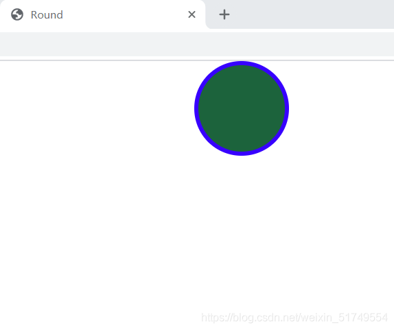
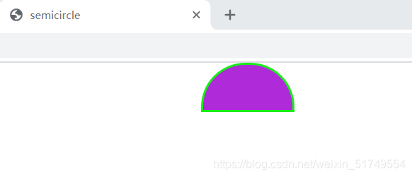
看一下我們變成了圓形! 來看看半圓形的吧�!
<!DOCTYPE html>
<html lang="en">
<head>
    <meta charset="UTF-8">
    <meta http-equiv="X-UA-Compatible" content="IE=edge">
    <meta name="viewport" content="width=device-width, initial-scale=1.0">
    <style>
        .box{
            width: 100px;
            height: 50px;
            background-color: rgb(175, 42, 216);
            border: 3px solid rgb(26, 236, 26);
            border-top-right-radius: 50px;
            border-top-left-radius: 50px;
            position:absolute;
            margin: 0 auto;
            left: 0;
            right: 0;
            bottom: 0;
            top: 0;
        }
    </style>
    <title>semicircle</title>
</head>
<body>
    <div class="box">

    </div>
</body>
</html>
來試試其他形狀!
<!DOCTYPE html>
<html lang="en">
<head>
    <meta charset="UTF-8">
    <meta http-equiv="X-UA-Compatible" content="IE=edge">
    <meta name="viewport" content="width=device-width, initial-scale=1.0">
    <style>
        .box{
            width: 100px;
            height: 100px;
            background-color: rgb(82, 84, 223);
            border-radius: 20px 15px 20px 10px;
            position: absolute;
            margin: 0 auto;
            left: 0;
            bottom: 0;
            right: 0;
            top: 0;
        }
    </style>
    <title>demo</title>
</head>
<body>
    <div class="box">

    </div>
</body>
</html>
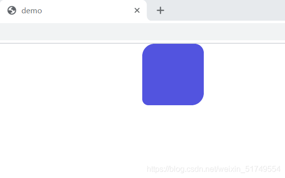
知識點分析:
border-radius:給元素設置圓角邊框
可以實現圓����,半圓�,橢圓,四分之一圓等各種圓角圖形��。
可以設置四個值�,分別為左上,右上�,右下����,左下
給個口訣����,“從左上開始順時針移動”。��。����。
希望這篇文章能讓你學會border-radius屬性!
到此這篇關于HTML+css盒子模型案例(圓��,半圓等)“border-radius” 簡單上手的文章就介紹到這了,更多相關html css盒子模型內容請搜索腳本之家以前的文章或繼續瀏覽下面的相關文章�,希望大家以后多多支持腳本之家!
