本文主要介紹了純html+css實現打字效果,具有一定的參考價值,感興趣的可以了解一下
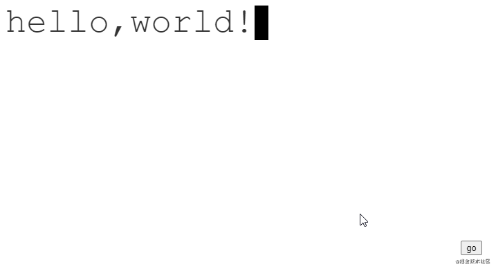
效果圖
分析
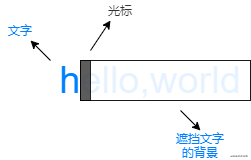
可以將動畫看做三個不同的層次:
文字是靜止的,而中間的背景和最上層的光標是動態的。
初始時,背景擋住所有的文字,光標在最左邊。
動畫進行時,背景和光標以相同的步伐從左往右移動。
動畫結束時,背景不再遮擋文字,光標則在最右邊閃爍。
代碼
html
<div class="text">hello,world!</div>
css
:root {
    /* 字符數量 */
    --steps: 12;
    /* 動畫時間 */
    --duration: 2.5s;
    /* 字體大小 */
    --fontSize: 50px;
    /* 光標大小 */
    --cursorSize: 20px;
}

.text {
    color: #333;;
    position: relative;
    display: inline-block;
    font-family: 'Courier New', Courier, monospace;
    font-size: var(--fontSize);
    line-height: 1;
}

.text::after {
    content: '';
    width: var(--cursorSize);
    height: var(--fontSize);
    background-color: black;
    z-index: 2;
    position: absolute;
    animation: blink 1s var(--duration) step-end infinite,
               moveCursor var(--duration) steps(var(--steps)) forwards;
}

.text::before {
    content: '';
    width: 100%;
    height: var(--fontSize);
    z-index: 1;
    position: absolute;
    background: linear-gradient(#fff, #fff) no-repeat top right;
    animation: showText var(--duration) steps(var(--steps)) forwards;
}

/* 光標閃爍動畫 */
@keyframes blink {
    0% {
        background-color: black;
    }
    50% {
        background-color: transparent;
    }
    100% {
        background-color: black;
    }
}

/* 光標移動動畫 */
@keyframes moveCursor {
    0% {
        left: 0%;
    }
    100% {
        left: 100%;
    }
}

/* 背景移動動畫 */
@keyframes showText {
    0% {
        background-size: 100% 100%;
    }
    100% {
        background-size: 0% 100%;
    }
}
注意
字體必須是等寬字體。因為光標每次移動的距離是是根據字符的數量 / 總寬度來決定的。
在線演示
到此這篇關于純html+css實現打字效果的文章就介紹到這了,更多相關html css打字效果內容請搜索腳本之家以前的文章或繼續瀏覽下面的相關文章,希望大家以后多多支持腳本之家!
