前言
在日常的業務數據分析 ,可視化是非常重要的步驟。這里總結了matplotlib常用繪圖技巧,希望可以幫助大家更加更加高效的、美觀的顯示圖表。作者:北山啦
Matplotlib 是 Python 的繪圖庫。 它可與 NumPy 一起使用,提供了一種有效的 MatLab 開源替代方案。 它也可以和圖形工具包一起使用,如 PyQt 和wxPython。
pip3 install matplotlib -i https://pypi.tuna.tsinghua.edu.cn/simple
import matplotlib.pyplot as plt
顯示中文
借助全局參數配置字典rcParams,只需要在代碼開頭,添加如下兩行代碼即可
plt.rcParams['font.sans-serif'] = ['SimHei']
plt.rcParams['axes.unicode_minus'] = False
同時還可以設置字體,常見字體:
font.family 字體的名稱
sans-serif 西文字體(默認)
SimHei 中文黑體
FangSong 中文仿宋
YouYuan 中文幼圓
STSong 華文宋體
Kaiti 中文楷體
LiSu 中文隸書
字體風格
plt.rcParams["font.style"] = "italic"
繪制子圖
plt.subplot2grid()
plt.subplot2grid((3,3),(0,0),colspan=3)
""""""
plt.subplot2grid((3,3),(1,0),colspan=2)
""""""
plt.subplot2grid((3,3),(1,2),rowspan=2)
""""""
plt.subplot2grid((3,3),(2,0))
""""""
plt.subplot2grid((3,3),(2,1))
plt.show()

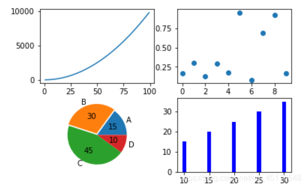
2. plt.subplot()
import numpy as np
import pandas as pd
import matplotlib.pyplot as plt
# 畫第1個圖:折線圖
x=np.arange(1,100)
plt.subplot(221)
plt.plot(x,x*x)
# 畫第2個圖:散點圖
plt.subplot(222)
plt.scatter(np.arange(0,10), np.random.rand(10))
# 畫第3個圖:餅圖
plt.subplot(223)
plt.pie(x=[15,30,45,10],labels=list('ABCD'),autopct='%.0f',explode=[0,0.05,0,0])

# 畫第4個圖:條形圖
plt.subplot(224)
plt.bar([20,10,30,25,15],[25,15,35,30,20],color='b')
plt.show()
matplotlib繪圖設置不顯示邊框、坐標軸
對于有些圖形我們希望通過隱藏坐標軸來顯得更加美觀
plt.xticks([])
plt.yticks([])
ax = plt.subplot(2,5,1)
# 去除黑框
ax.spines['top'].set_visible(False)
ax.spines['right'].set_visible(False)
ax.spines['bottom'].set_visible(False)
ax.spines['left'].set_visible(False)
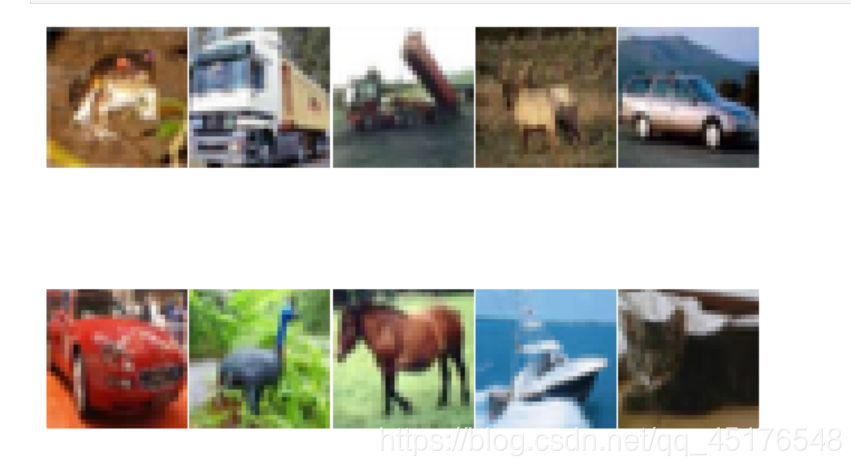
實例:
#author:https://beishan.blog.csdn.net/
import matplotlib.pyplot as plt
for i in range(0,10):
    fig = plt.gcf()
    fig.set_size_inches(12,6)
    ax = plt.subplot(2,5,i+1)
    # 去除坐標軸
    plt.xticks([])
    plt.yticks([])

    # 去除黑框
    ax.spines['top'].set_visible(False)
    ax.spines['right'].set_visible(False)
    ax.spines['bottom'].set_visible(False)
    ax.spines['left'].set_visible(False)
    # 設置各個子圖間間距
    plt.subplots_adjust(left=0.10, top=0.88, right=0.65, bottom=0.08, wspace=0.02, hspace=0.02)
    ax.imshow(Xtrain[i],cmap="binary")
提高分辨率
如果感覺默認生成的圖形分辨率不夠高,可以嘗試修改 dpi 來提高分辨率
plt.figure(figsize = (7,6),dpi =100)
設置繪圖風格
有時我們會覺得matplotlib默認制作出來的圖片太樸素了,不夠高級,其實開發者也內置了幾十種主題讓我們自己選擇,只要使用plt.style.use(‘主題名')指定主題即可
常用的樣式有
Solarize_Light2
_classic_test_patch
bmh
classic
dark_background
fast
fivethirtyeight
ggplot
grayscale
seaborn
seaborn-bright
seaborn-colorblind
seaborn-dark
seaborn-dark-palette
seaborn-darkgrid
seaborn-deep
seaborn-muted
seaborn-notebook
seaborn-paper
seaborn-pastel
seaborn-poster
seaborn-talk
seaborn-ticks
seaborn-white
seaborn-whitegrid
tableau-colorblind10
添加標題
plt.title("2020-2021北山啦粉絲數增長圖")
顯示網格
plt.grid()
plt.grid(color='g',linewidth='1',linestyle='-.')
圖例設置
plt.legend(["2020","2021"],loc="best")
也可以給圖例添加標題
plt.plot([1,3,5,7],[4,9,6,8],"ro--")
plt.plot([1,2,3,4], [2,4,6,8],"gs-.")
plt.legend(["2020","2021"],loc="best",title="標題")
plt.title("2020-2021北山啦粉絲數增長圖")
添加公式
有時我們在繪圖時需要添加帶有數學符號、公式的文字,
plt.text(11000,0.45,r'擬合曲線為$f(x) = x^2-4x+0.5$')
圖形交互設置
jupyter中的魔法方法
%matplotlib notebook 彈出可交互的matplotlib窗口
%matplotlib qt5 彈出matplotlib控制臺
%matplotlib inline 直接嵌入圖表,不需要使用plt.show()
保存圖片
plt.savefig("pic.png",dpi=100,bbox_inches="tight")
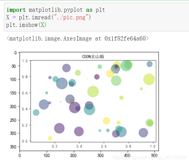
讀取圖片
方法一
from PIL import Image
image = Image.open("./pic.png")
image.show()
方法二
import matplotlib.pyplot as plt
X = plt.imread("./pic.png")
plt.imshow(X)
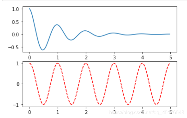
條形圖
def f(t):
    return np.exp(-t) * np.cos(2*np.pi*t)
a = np.arange(0,5,0.02)

plt.subplot(211)
plt.plot(a,f(a))

plt.subplot(212)
plt.plot(a,np.cos(2*np.pi*a),'r--')

plt.show()
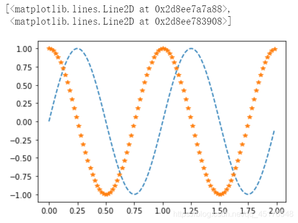
b = np.arange(0,2,0.02)
plt.plot(b,np.sin(2*np.pi*b),'--',b,np.cos(2*np.pi*b),"*")
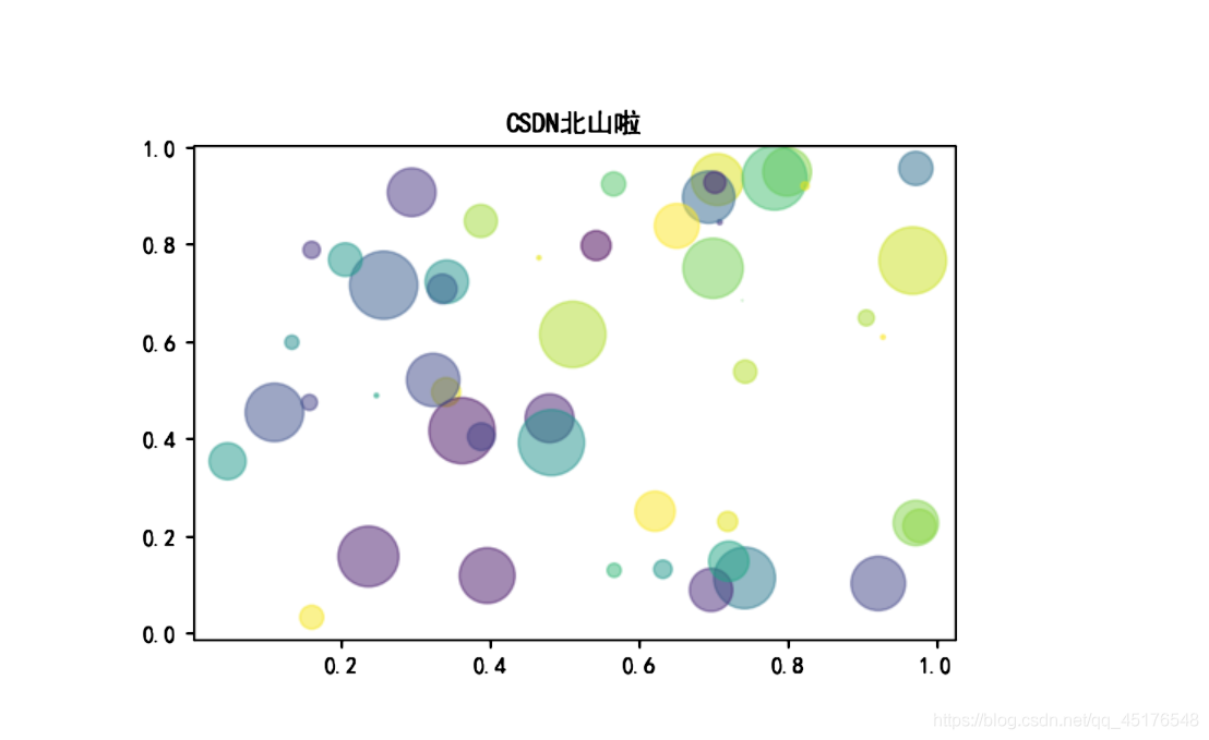
散點圖
import numpy as np
import matplotlib.pyplot as plt

# Fixing random state for reproducibility
np.random.seed(19680801)


N = 50
x = np.random.rand(N)
y = np.random.rand(N)
colors = np.random.rand(N)
area = (30 * np.random.rand(N))**2  # 0 to 15 point radii

plt.scatter(x, y, s=area, c=colors, alpha=0.5)
plt.show()

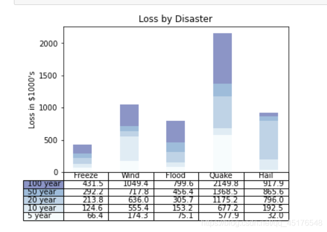
帶表格的圖形
import numpy as np
import matplotlib.pyplot as plt


data = [[ 66386, 174296,  75131, 577908,  32015],
        [ 58230, 381139,  78045,  99308, 160454],
        [ 89135,  80552, 152558, 497981, 603535],
        [ 78415,  81858, 150656, 193263,  69638],
        [139361, 331509, 343164, 781380,  52269]]

columns = ('Freeze', 'Wind', 'Flood', 'Quake', 'Hail')
rows = ['%d year' % x for x in (100, 50, 20, 10, 5)]

values = np.arange(0, 2500, 500)
value_increment = 1000

# Get some pastel shades for the colors
colors = plt.cm.BuPu(np.linspace(0, 0.5, len(rows)))
n_rows = len(data)

index = np.arange(len(columns)) + 0.3
bar_width = 0.4

# Initialize the vertical-offset for the stacked bar chart.
y_offset = np.zeros(len(columns))

# Plot bars and create text labels for the table
cell_text = []
for row in range(n_rows):
    plt.bar(index, data[row], bar_width, bottom=y_offset, color=colors[row])
    y_offset = y_offset + data[row]
    cell_text.append(['%1.1f' % (x / 1000.0) for x in y_offset])
# Reverse colors and text labels to display the last value at the top.
colors = colors[::-1]
cell_text.reverse()

# Add a table at the bottom of the axes
the_table = plt.table(cellText=cell_text,
                      rowLabels=rows,
                      rowColours=colors,
                      colLabels=columns,
                      loc='bottom')

# Adjust layout to make room for the table:
plt.subplots_adjust(left=0.2, bottom=0.2)

plt.ylabel("Loss in ${0}'s".format(value_increment))
plt.yticks(values * value_increment, ['%d' % val for val in values])
plt.xticks([])
plt.title('Loss by Disaster')

plt.show()
總結
到此這篇關于Python matplotlib實用繪圖技巧的文章就介紹到這了,更多相關matplotlib繪圖技巧內容請搜索腳本之家以前的文章或繼續瀏覽下面的相關文章希望大家以后多多支持腳本之家!
您可能感興趣的文章:- Python matplotlib可視化繪圖詳解
- Python繪圖之詳解matplotlib
- Python繪圖庫Matplotlib的基本用法
- python matplotlib繪圖實現刪除重復冗余圖例的操作
- python 繪圖模塊matplotlib的使用簡介
- Python matplotlib繪圖詳解